

Minard’s Map of Napoleon’s Russian Campaign (1869)
"'The best statistical graphic ever drawn': Visualizing the catastrophic loss of 422,000 soldiers"
Minard visualized Napoleon's 1812 invasion of Russia by combining six variables in a single flow diagram: army size, geographical location, direction of movement, river crossings, date, and sub-zero winter temperatures during the retreat.
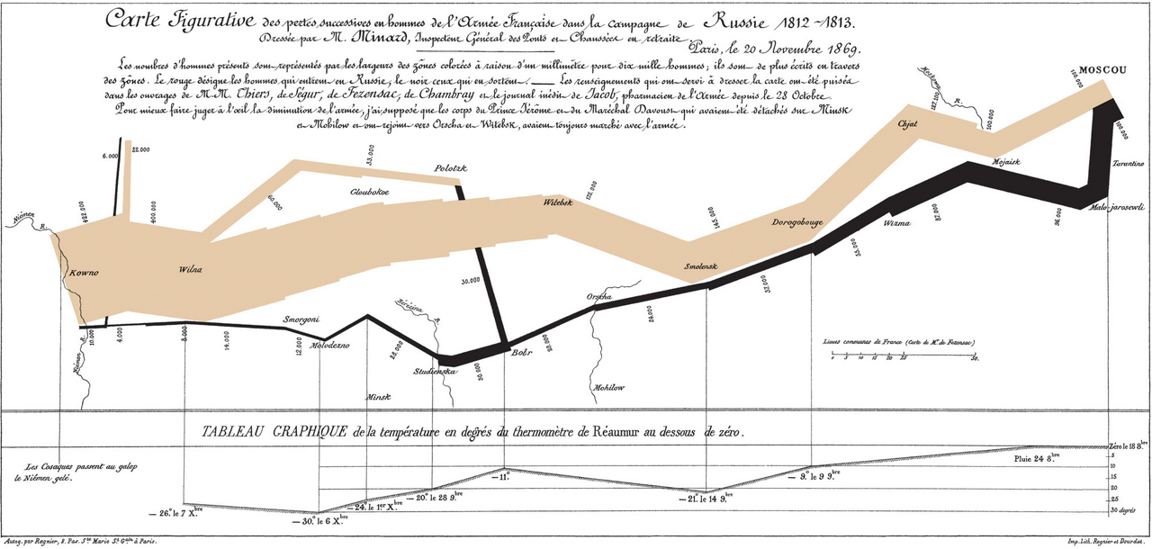
- Width of the brown band represents troop strength marching toward Moscow
- Black band shows the retreat, tied directly to a freezing temperature chart below
- Catastrophic thinning of the band at the Berezina River crossing
Image credit and reuse
Minard’s Map of Napoleon’s Russian Campaign (1869)
Charles Minard (1781–1870); via Wikimedia Commons
Public domain under the individual source record. Metadata added; image pixels unchanged. Display crop may vary by viewport. Retain source credit and terms. Historical mapmaking context is separate from this image reproduction.
The Rhetorical & Ideological Argument
"An anti-war masterpiece demonstrating that military hubris and brutal winter geography destroyed the Grande Armée—shrinking from 422,000 men entering Russia to just 10,000 survivors returning."
- Width of the brown band represents troop strength marching toward Moscow
- Black band shows the retreat, tied directly to a freezing temperature chart below
- Catastrophic thinning of the band at the Berezina River crossing
- Battle tactics, commander heroics, and glorious imperial portraits